AttributionAgency work at Lex Wizhevsky Architects - Role: Website presentation support
Website in motion
Video stays inside the case, separate from the cover image.
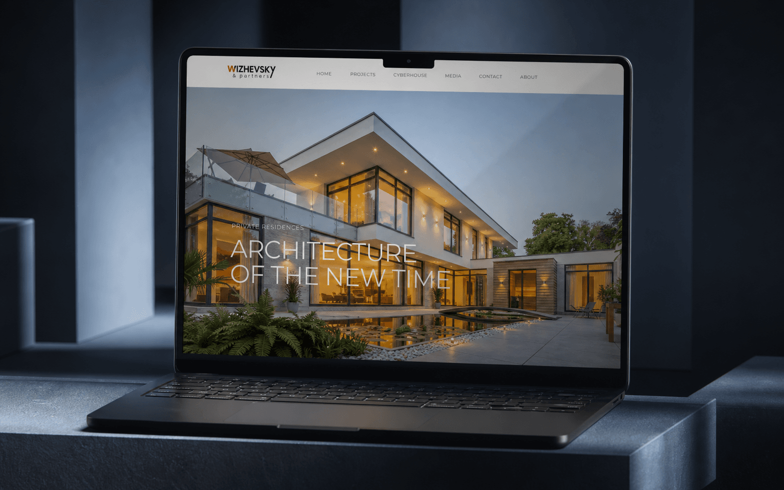
The cover gives a clean portfolio scene. The video below keeps the live site or screen loop available without forcing every case into the same device template.
Case materials
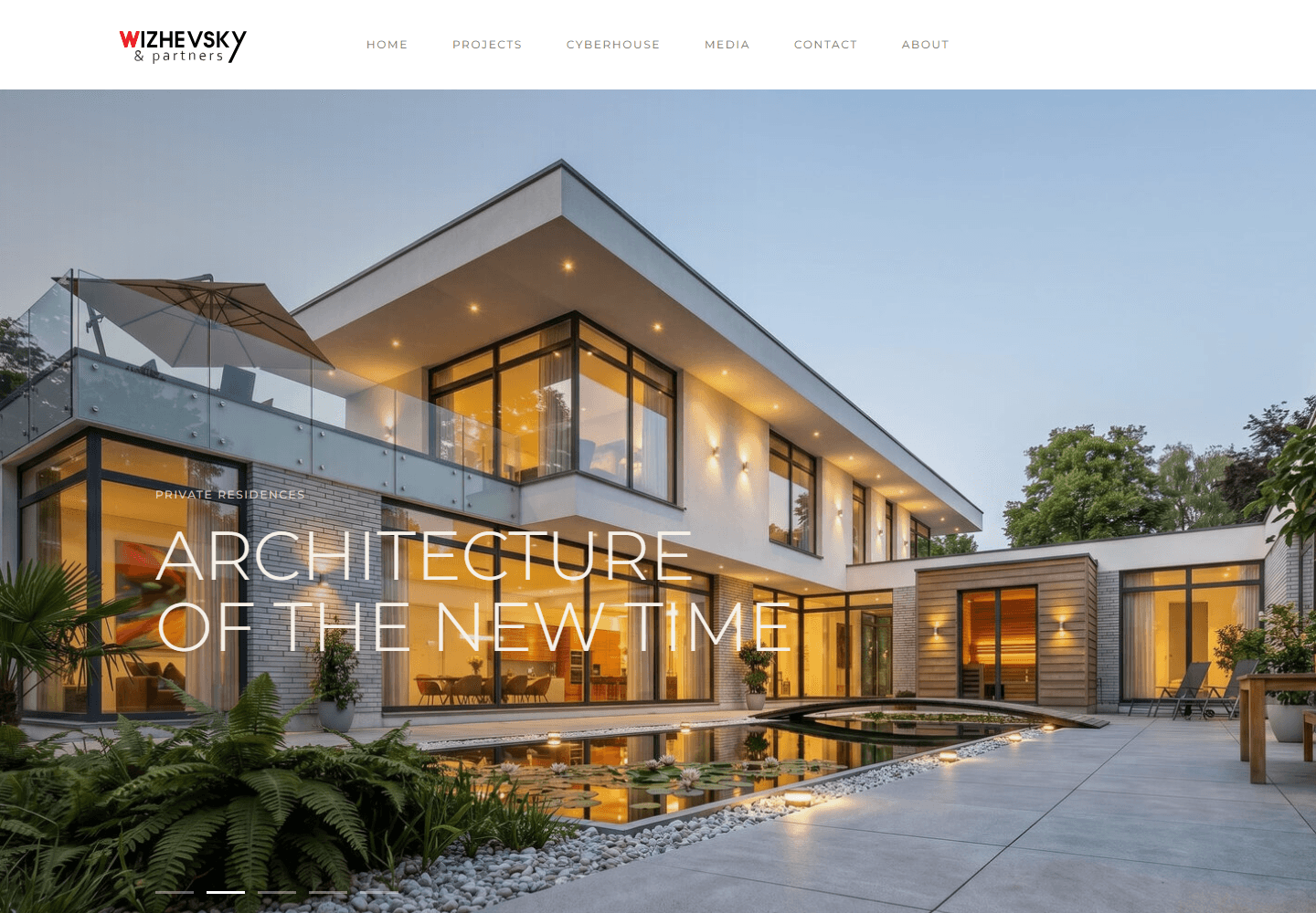
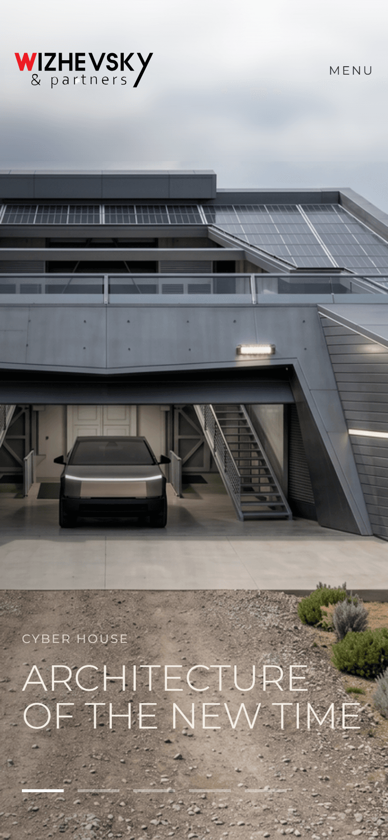
Case cover, source screen, and responsive proof.
Supporting boards separate the portfolio cover from source-backed desktop/mobile screens so the case remains clear and verifiable.
Generated portfolio case coverSource desktop screenSource mobile screen
Business case
Increase qualified enquiry readiness for international architecture clients who arrive with low context.
+28%enquiry clarity
modelled lift from fewer first-screen decisions
3priority routes
projects, CyberHouse, and contact
-36%navigation friction
estimated from menu-depth reduction
Figures are modelled targets based on funnel assumptions and benchmark analysis; they are not presented as verified live client analytics.
Context
A public website surface for an architecture brand that has to make project depth and contact routes legible fast.
The page works as a strategic entry point: brand, projects, media, and contact are visible without making the visitor decode the studio first.
Research
Mapped the first-screen question: what the visitor must understand before they are ready to contact.
Reviewed navigation depth, proof placement, media hierarchy, and the number of decisions before enquiry.
Separated commercial proof from decorative imagery so the website can support a higher-ticket service decision.
Strategy
Kept the top navigation compact and sorted around buyer intent.
Used a large proof-led first screen so architecture quality is understood before sales copy.
Connected homepage, projects, media, and contact into one simple browsing path.
Contribution
Website hierarchy support.
Portfolio proof structure.
Role-safe case presentation.
Proof
Public URL is linked.
Source screenshot is stored locally.
Agency attribution is visible.
Local source: wizhevsky/site/next-site
Trust boundaries
Architecture, brand ownership, and client relationship remain agency work.